For the new cc-tapis headquarters in Milan Parisotto+Formenton Architetti in collaboration with Daniele Lora, art director of the brand, chose Qu to oversee the lighting project dedicated to the famous Italian company, producer of contemporary carpets.
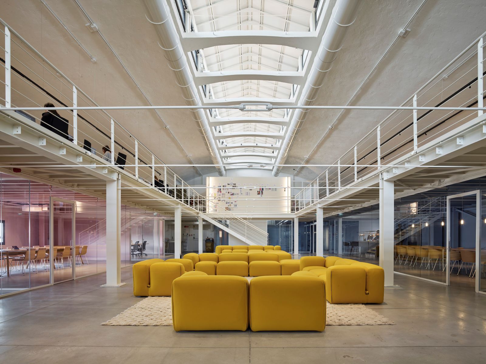
cc-tapis is housed in an industrial building characterized by imposing volumes and a skylight that brings natural zenithal light inside both on the main floor, dedicated to the offices, and on the mezzanine above. It is, in fact, a dynamic workspace in which various operational, strategic and convivial activities converge, in which visual comfort and the quality of light are crucial. For each space, a different type of lighting was therefore necessary.
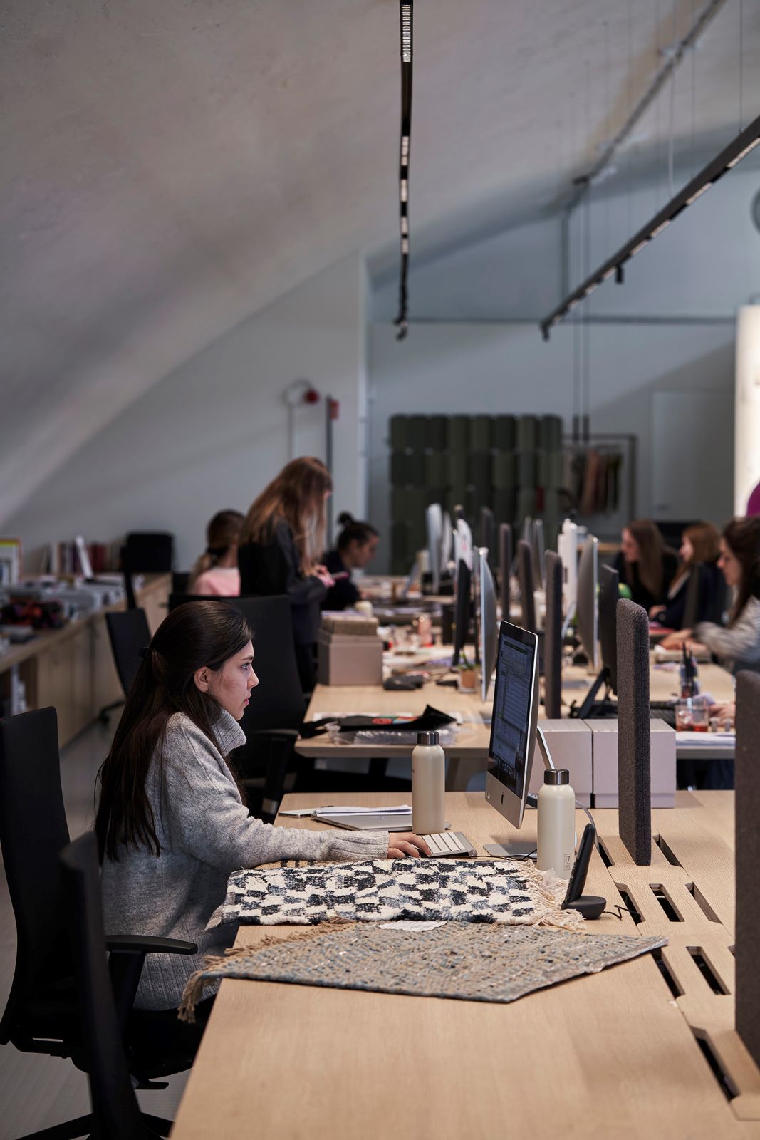
The lighting performance of the lighting fixtures was another determining element of the entire project, especially as regards the area dedicated to the creative team who works with nuances and textile materials on a daily basis. Qu proposed lighting systems with a very high color rendering (>95) which allows for extremely faithful color reproduction, especially on reds.
In the operating stations, lighting suitable for computer activities has been provided.
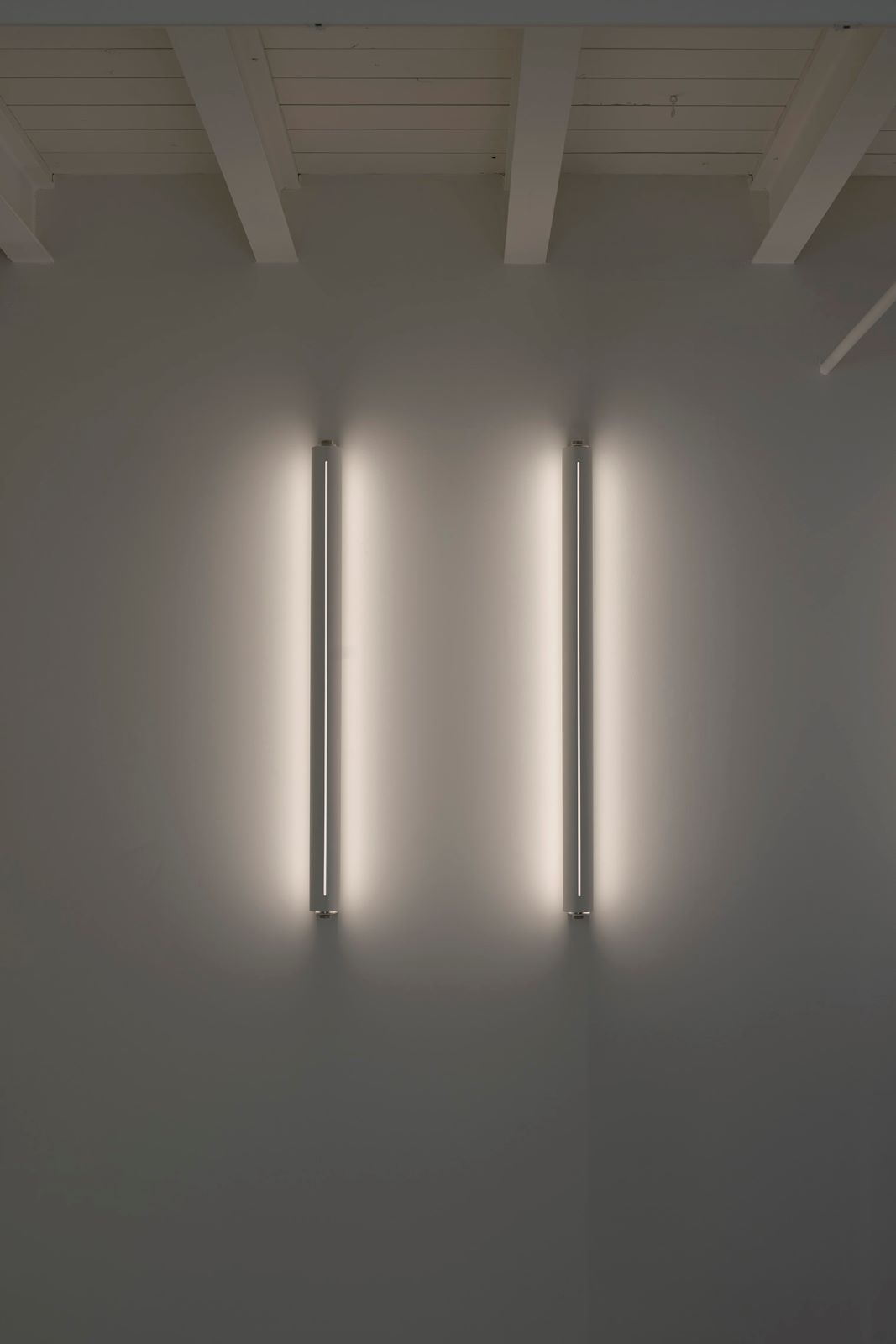
A totally different approach was applied to the spaces for extra moments: for example, a very low and soft light was chosen in the relaxation and meditation room, while for the large shared dining table in the kitchen area, the focus was on the Dress Me series, design by 23 Bassi Studio di Architettura, with diffused light suspensions.
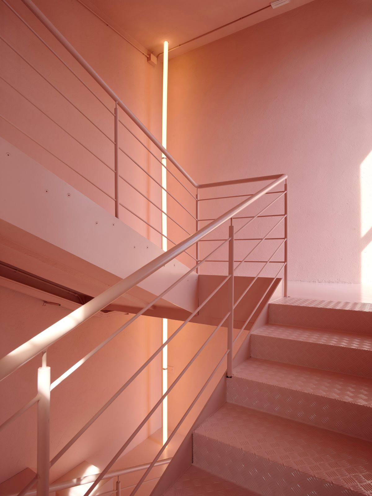
Color, in addition to being the dominant material of daily work, is also a connotative element of the entire internal and external project. Inside, two color schemes coexist and contrast, one colored and one neutral, also defining the use of the spaces. The color delimits passage areas, such as corridors, meeting rooms and the kitchen.
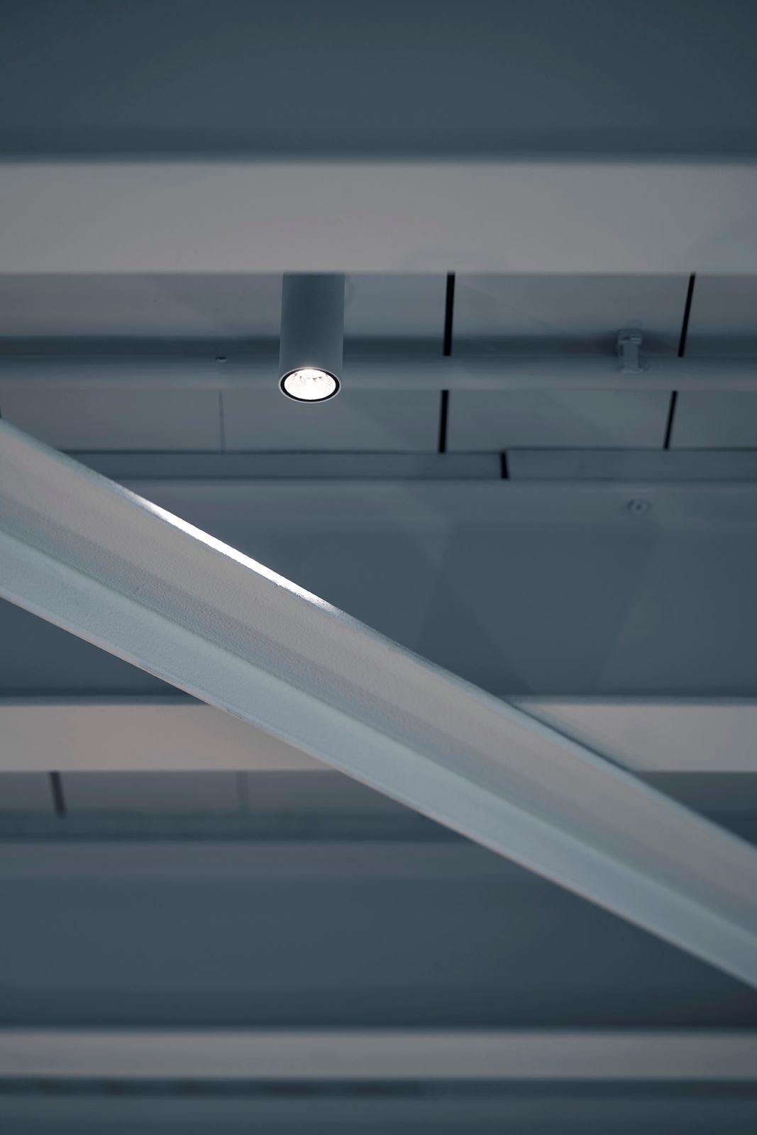
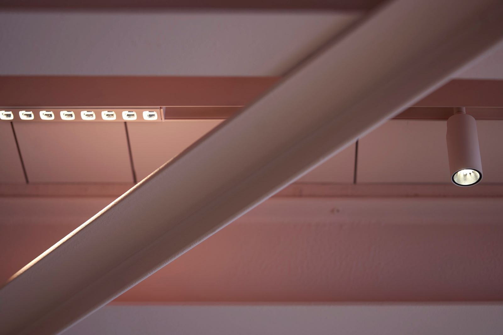
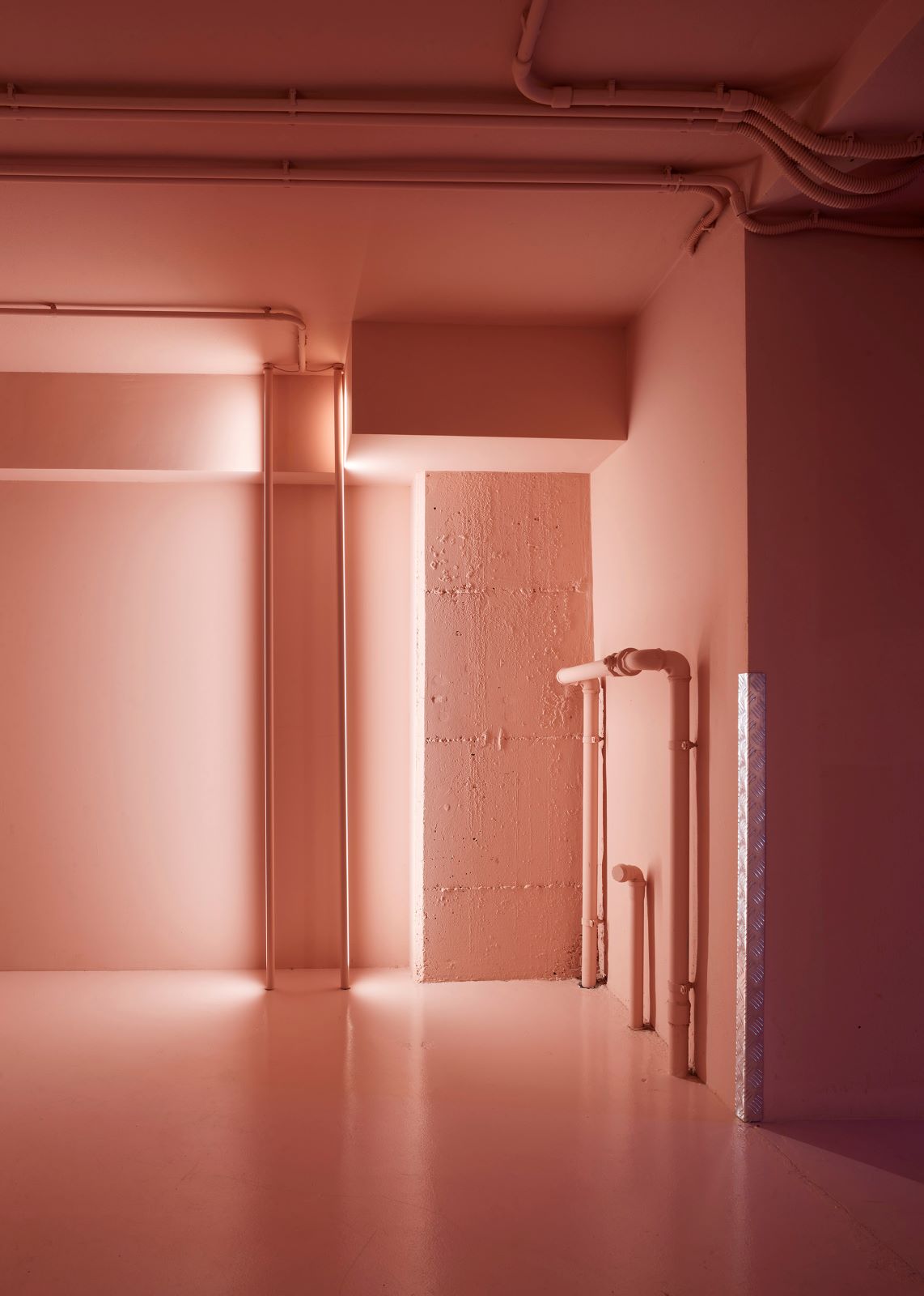
There are two dominant colours: pink and blue. Pink accompanies the vertical paths along the stairs, and penetrates towards the more internal areas, while on the main floor there is a clear division between the two areas with a pink and blue total look. In total semantic coherence, each Qu product, such as tracks, suspensions, floor lamps and spotlights, has been customized in color to better coordinate with the monochrome of the environment. Neutrality, on the other hand, defines the operational areas in which the cc-tapis team works daily with a wide spectrum of colors.
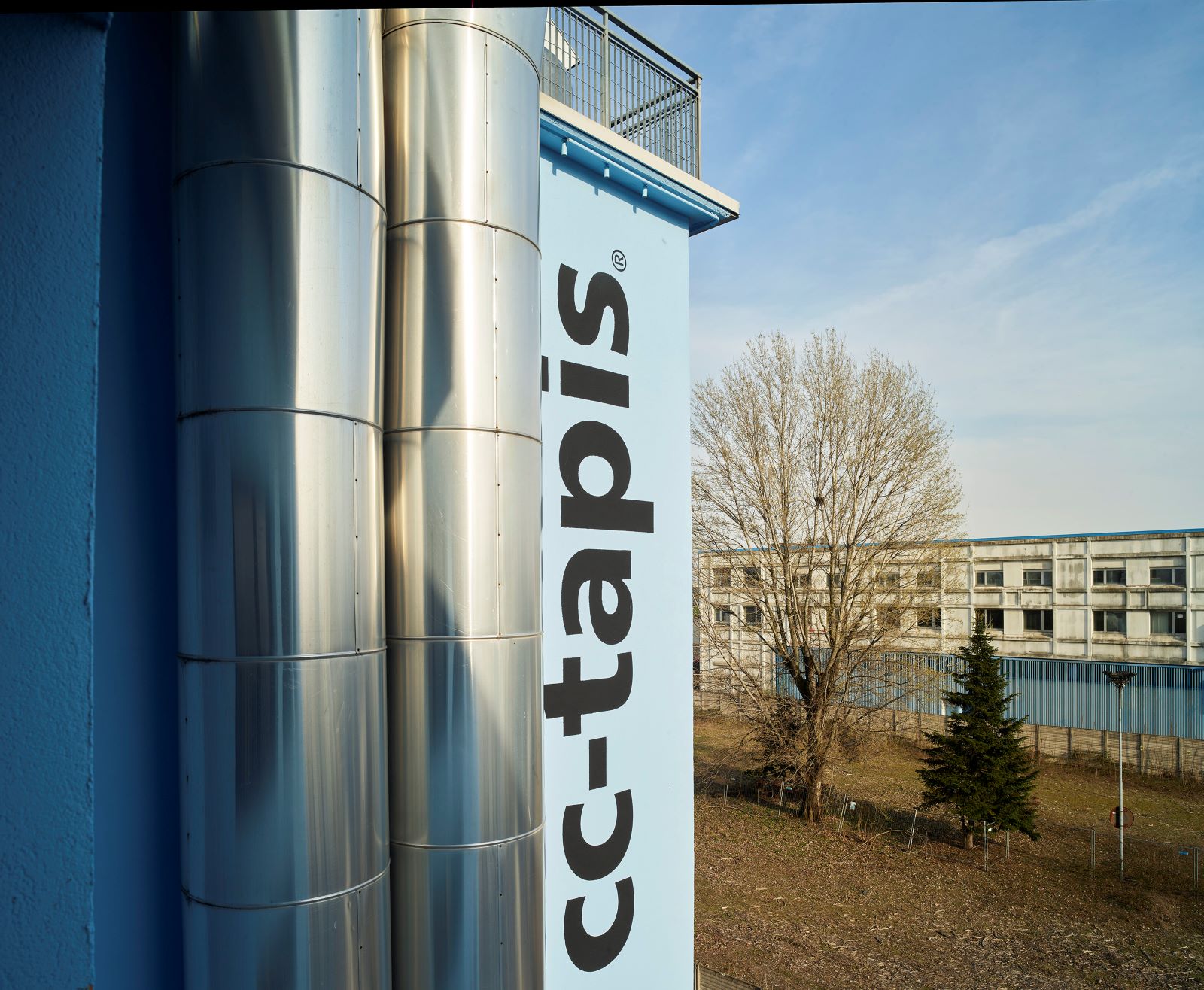
Outside, a sky blue monochrome completely covers the architectural volume, until it merges with the celestial vault above.