Over the last three years Migliore+Servetto Architects has been handling the relaunch of dmail, whose single-brand stores are 27 in 18 different cities in Italy, and today, after the corporate identity and the new format store, Migliore+Servetto Architects designs the brand’s new headquarters in Pontassieve, in the province of Florence.
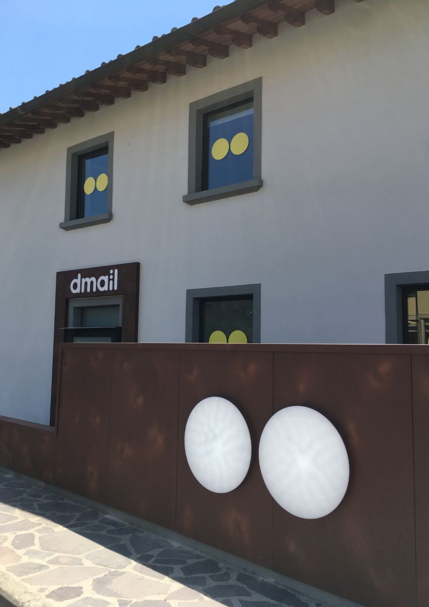
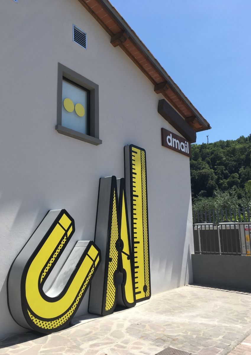
The interior design project encompasses a space spanning 1200 square meters, distributed over 2 floors and including an outdoor area: the graphic symbol of the logo, designed by Migliore+Servetto in 2016, underpins the building’s façade dominated by three luminous signs carved into Corten-effect panes, while the pace of the pathway leading to the building is also marked by the graphic design characterizing the small entrance wall with the circular element, which recalls the development of environmental graphics in the new stores.
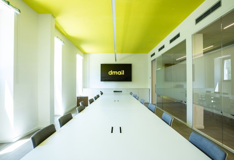
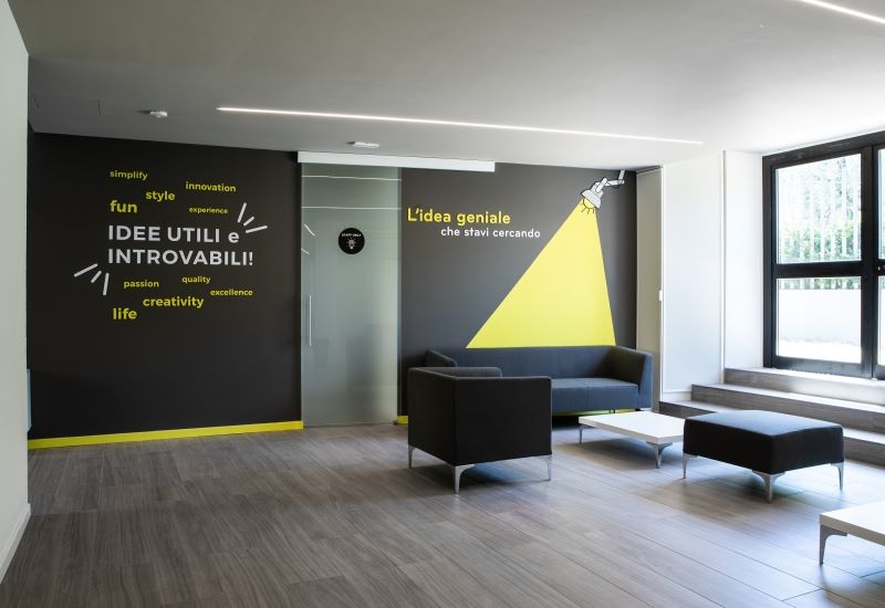
A faithful reproduction of the new format store is laid out on the ground floor, which is dedicated to the product and communication of the brand: a reception lounge area is located at the entrance followed by a large meeting room and an area intended for people to get together and rest; on the other side, there is a technical space dedicated to the product, including the storeroom, the product test area and the photo room, where every object is photographed before being offered for sale.
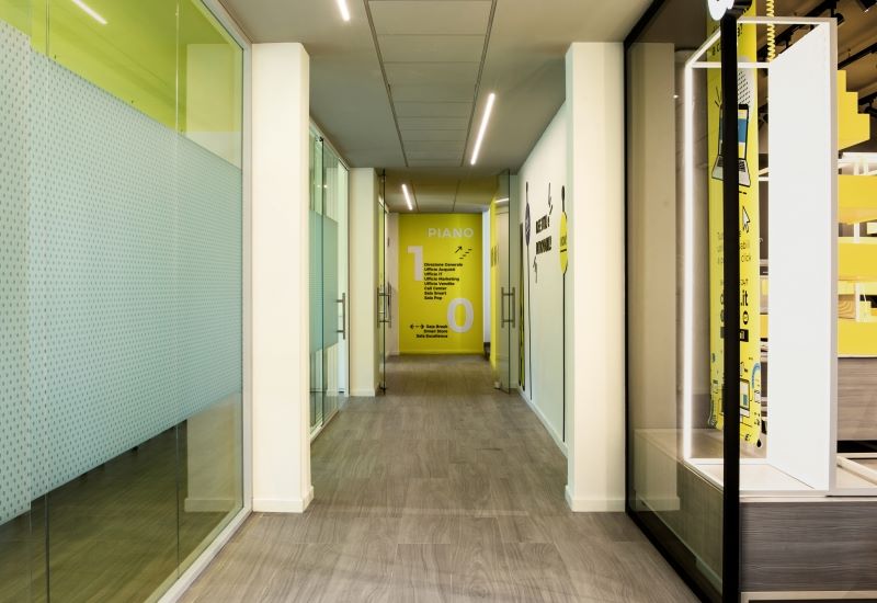
The upper floor, where the company’s operations are based, is structured by using the corridor as the central element from which the offices open up. Here the different activities are marked by wayfinding sings, located on the side walls; in addition, thanks to a system with different modules and volumes, a long multifunctional wall measuring about 35 meters long, hosts furniture, seats, open bookcases and numbered lockers, transforming the corridor into a connection and meeting place.
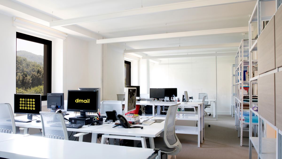
Light is the main element that provides continuity to the design: in the headquarters the light also serves as the element underlining the distribution of the working spaces, defining the pathway; in fact, the space is characterized by linear, continuous LED elements, which are recessed and suspended, emphasizing the perspectives of the corridor, the architecture and the distribution of the spaces, while at the same time offering direct lighting over the desks.
On the other hand, brillant yellow, a symbol of light and energy, enters into dialogue with gray and white to form the identity character that defines the whole space, in keeping with the corporate identity that distinguishes the stores and web site.
Similarly, the design of the new dmail headquarters also features an intuitive, informal graphic system built on two levels, which leads the visitor through the space thanks to a system of graphic icons and key words.
All dmail’s communication is conceived to evoke the idea of a young, curious, lively brand: it is no coincidence that in developing the corporate identity, the Migliore+Servetto studio decided to create two over-sized circles to recall the image of two curious eyes looking for the most original ideas, two key features can be varied in many different ways, in terms of color, texture and transparency, thus building up a family of different but homogeneous elements with a strong visual identity.
The office thus becomes a place for narration and communication that expresses and strengthens the brand identity: it is a meeting and welcoming place where the light and the graphic sign open up new perspectives and the potential for exploration.


