The complete and radical renovation of a Milanese apartment by Chromastudio focused on redistributing the areas to make them more usable.
The old gives way to the new with a focus on recovery, where colour and its geometry, in contrast with neutral tones, shape new scenarios, in a continuous play between what’s horizontal and vertical, curved and linear.
The apartment, which is about 90 square meters, was redistributed in order to get a bigger living area, a more comfortable bathroom, and more storage space in line with the new living standards.
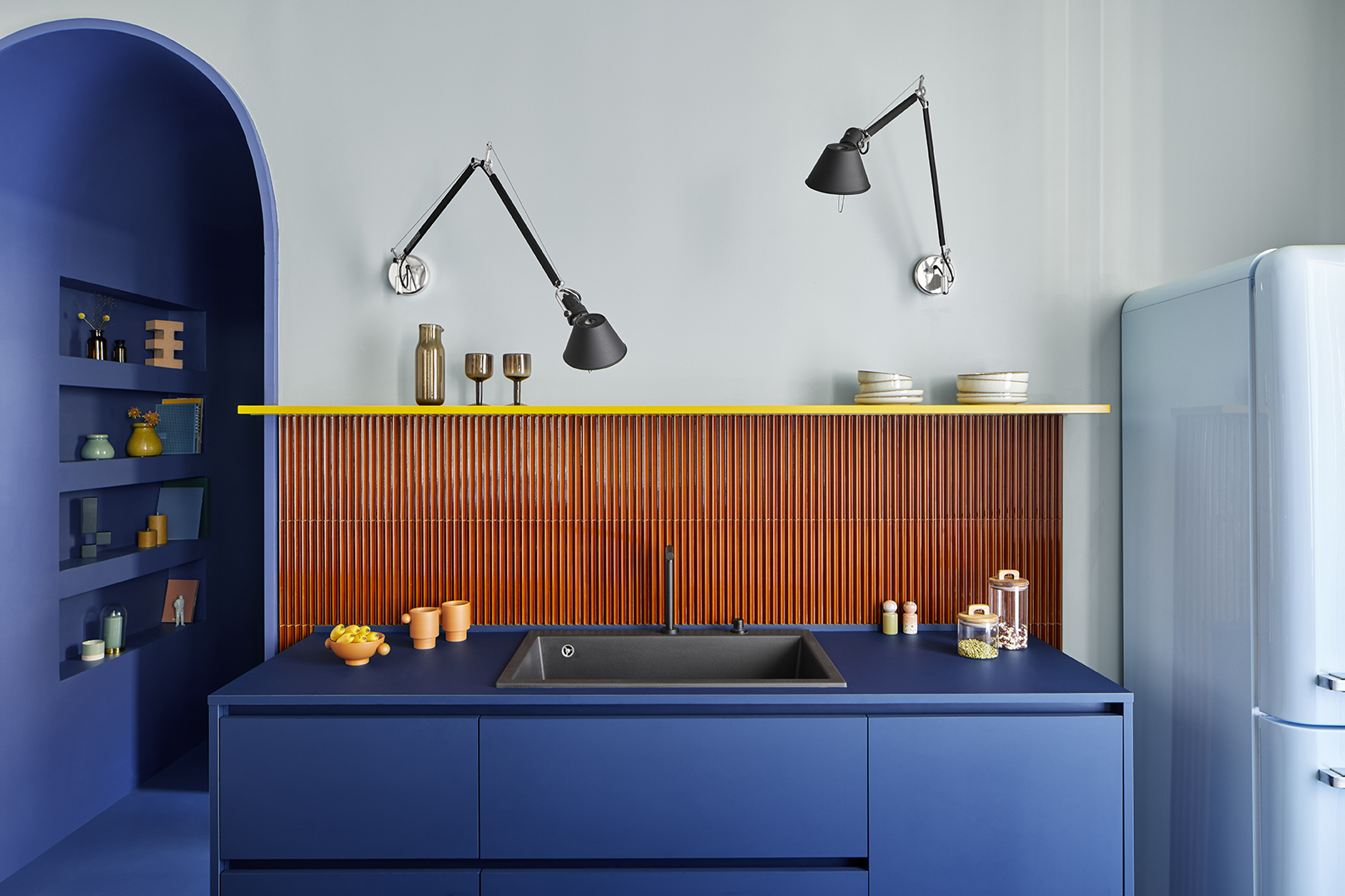
With 35 square meters, the living area is the heart of the apartment, while the island kitchen in royal blue – a chromatic monolith made by Cesar Cucine and supplied by Mo1950 – is the heart of the project and is placed in the centre of the room to highlight its beauty.
The colour of the kitchen is also used for the entrance corridor, whose passage has been rounded to create a barrel vault; it’s like a long, royal blue tunnel, as if to anticipate the story ahead.
In the kitchen and entrance corridor, the iroko wood floor was removed and replaced with cement material in the same shade of blue used in this area, like a carpet that identifies this functional space without real limits. Its shade was made on request and laid by Innovative Surface.
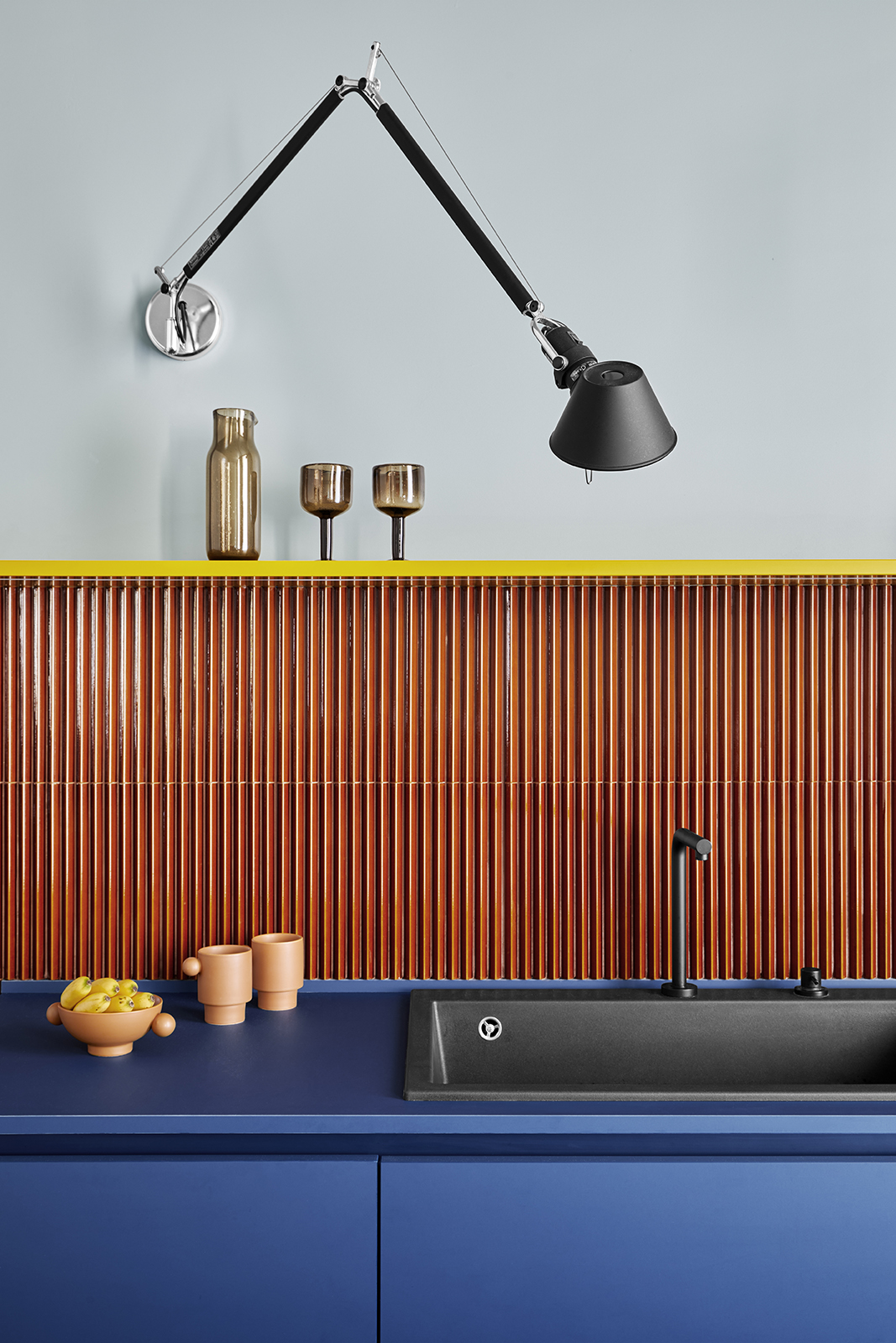
The geometric and chromatic elements are the heart of this project. To highlight the handcrafted component of this retro-style project, the kitchen walls feature 3D tiles with a triangular section, the Rombini Triangle by Mutina in the glossy glazed version with a bright colour. In keeping with the retro style of the project, the light blue Smeg refrigerator fits in without strong contrast.
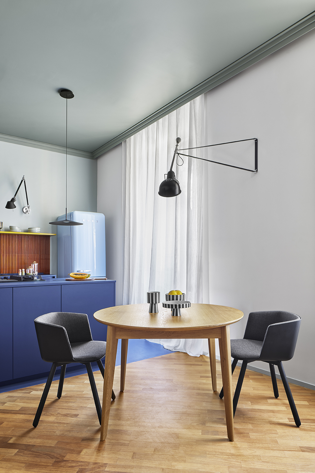
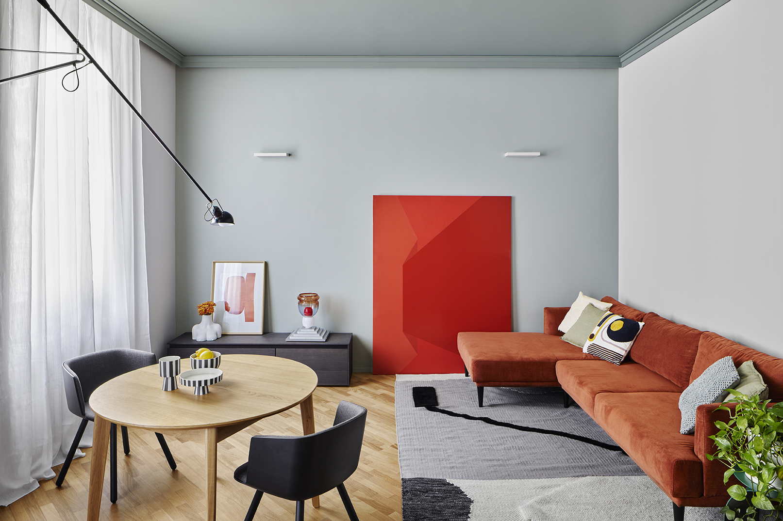
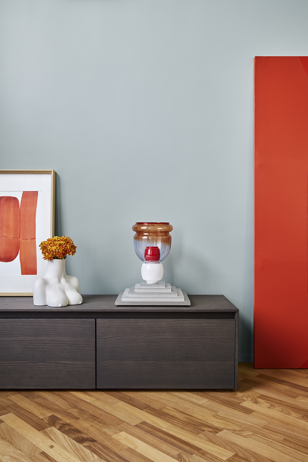
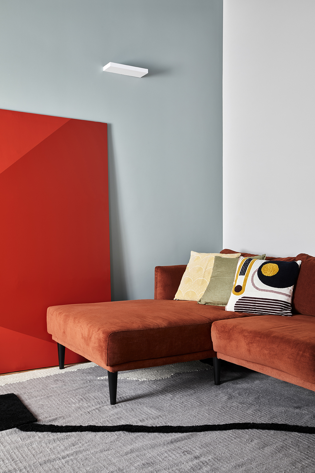
Combined with the kitchen, the living room is a unique environment with high ceilings and a rectangular shape. The long, brighter walls, pierced by windows and the two doors leading to the sleeping area, are painted in a light ash colour, contrasting with the light Celadon green on the short walls and its darker version on the ceiling. A contrast also exists between cold and warm tones; the colours used for the walls contrast with the rust coloured sofa. The painting by Giorgio Pasqualetti and the glass lamp by Paola Croci emerge from the back wall giving it value.
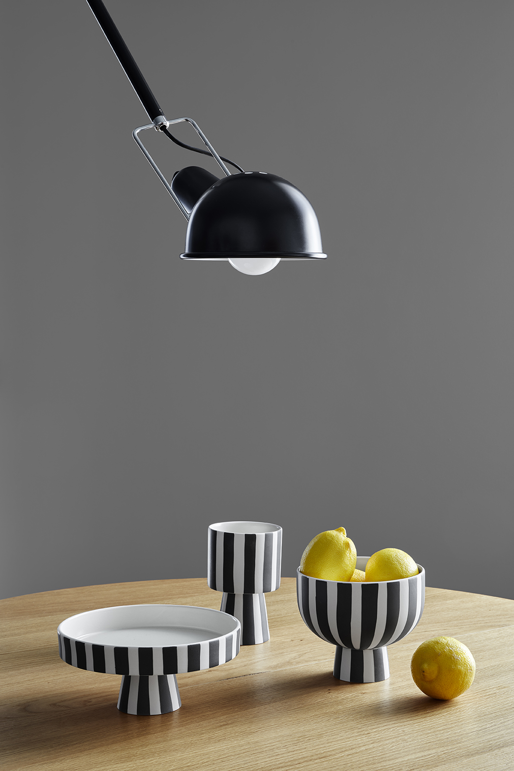
The common thread behind the whole project is represented by black references, like the Flos lamp “model 265” whose arm draws a perspective line in the space, which is reflected in the decorative motif of the wool and cotton carpet by Bianco di Karpeta.
The decorative string of plaster frames running around the entire perimeter becomes the connecting link between the living area and the kitchen.
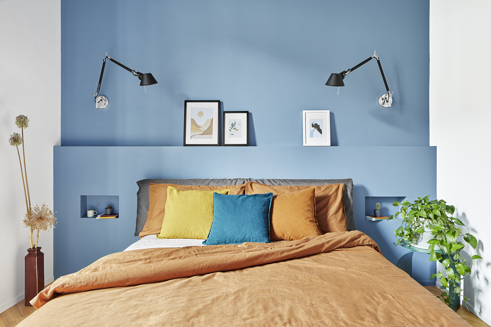
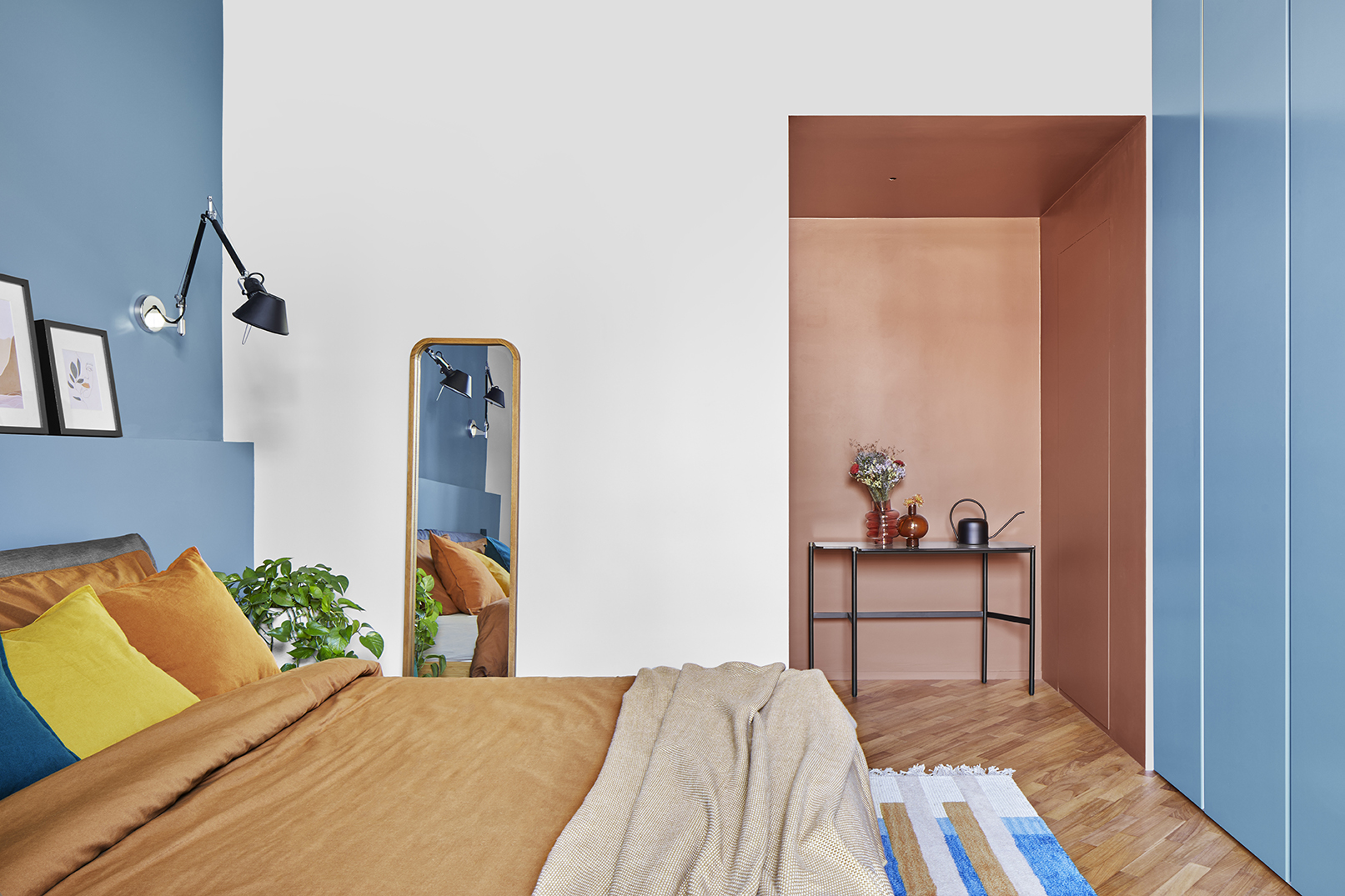
As we move to the sleeping area, we find the double bedroom. Redistribution work was done here as well, demolishing the fitted walk-in closet and creating an anteroom between the living room and the bedroom so this area is more private. It’s painted in a red clay tone and hides two very spacious and comfortable storage closets, one at height and one flush with the wall.
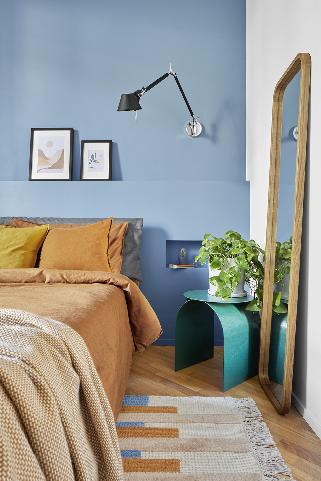
The room is a quadrangular solid with long sides in a light ash tone and an inverted U with the short walls and the ceiling, which is painted in cornflower blue. The headboard has been enriched with a 120cm-high fitted wainscoting that contains two bedside tables. On the opposite wall, the wardrobe has 6 flush-to-wall doors matching the context. The soft, harmonious palette of red clay, cornflower blue, and light ash creates a calming and restful vibe.
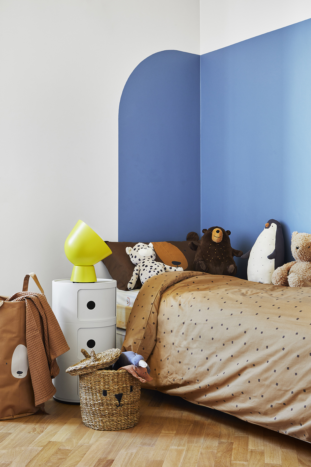
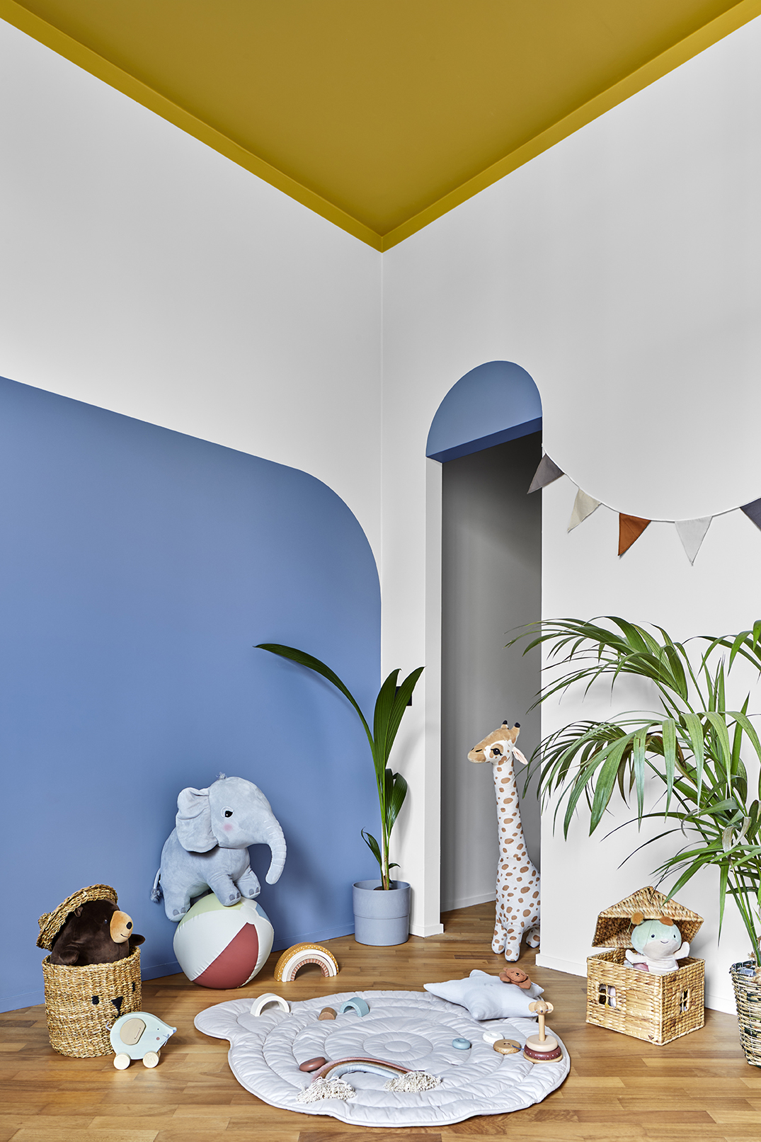
The second bedroom is the kid’s room. In this case, simple geometric shapes and primary colours were used. The high wainscoting in Savoy blue creates a chromatic corner that delimits the space dedicated to rest. The same colour is then used in the decorative arch of the walk-in closet, which contrasts with the ocher yellow descending slightly from the ceiling to the walls as if to delimit a safe and protected area.
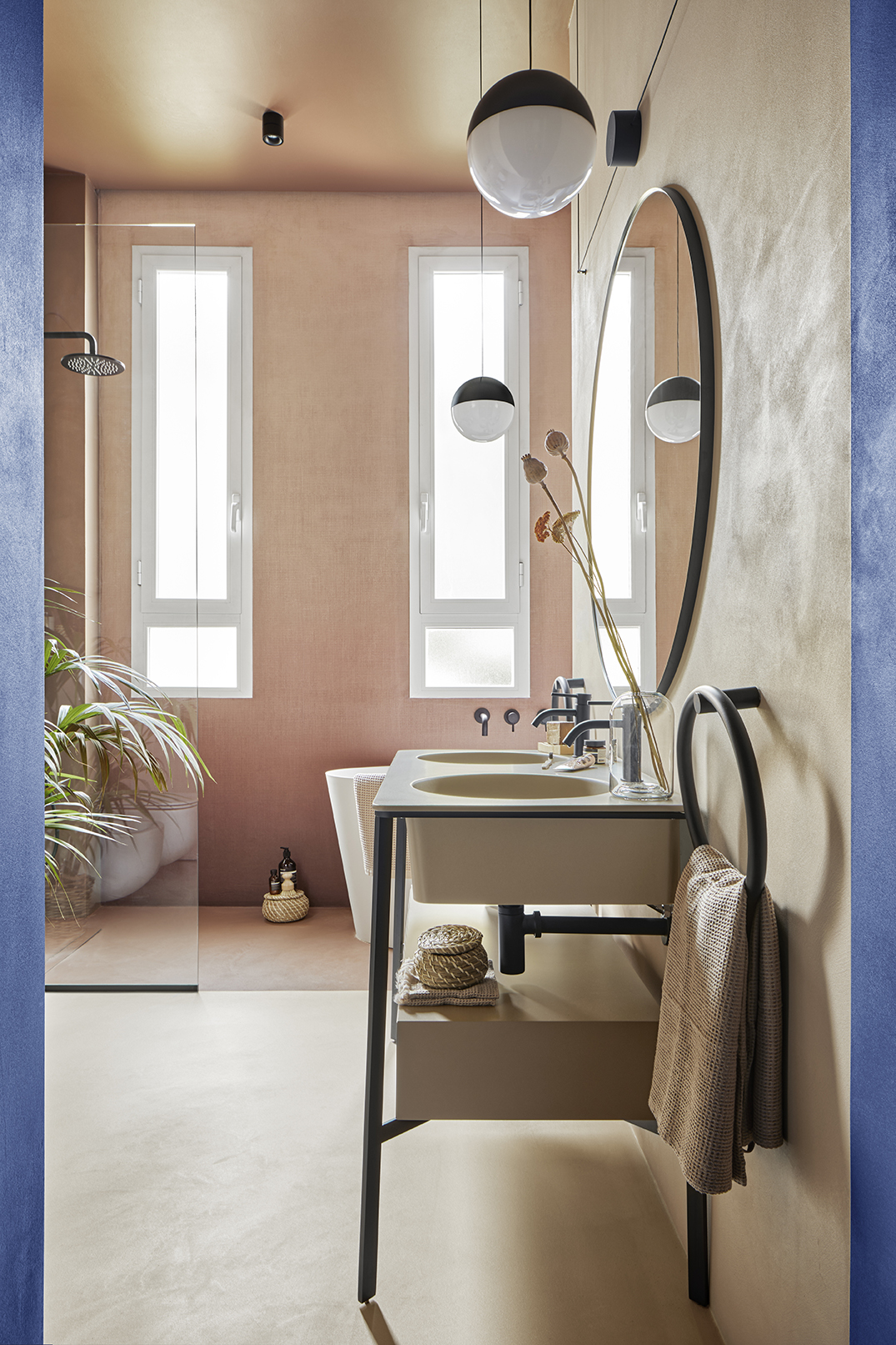
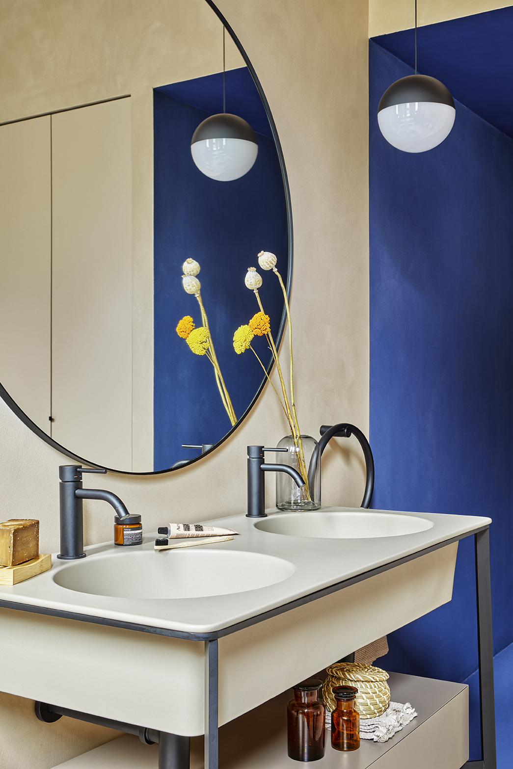
The bathroom of this apartment has been completely customised to fit the client’s needs. It’s got a double basin from the “I Catini” collection by Ceramica Cielo complete with a storage drawer, a spacious walk-in shower, a bathtub and a laundry area built into a custom wardrobe. Access to the bathroom is through the entrance corridor.
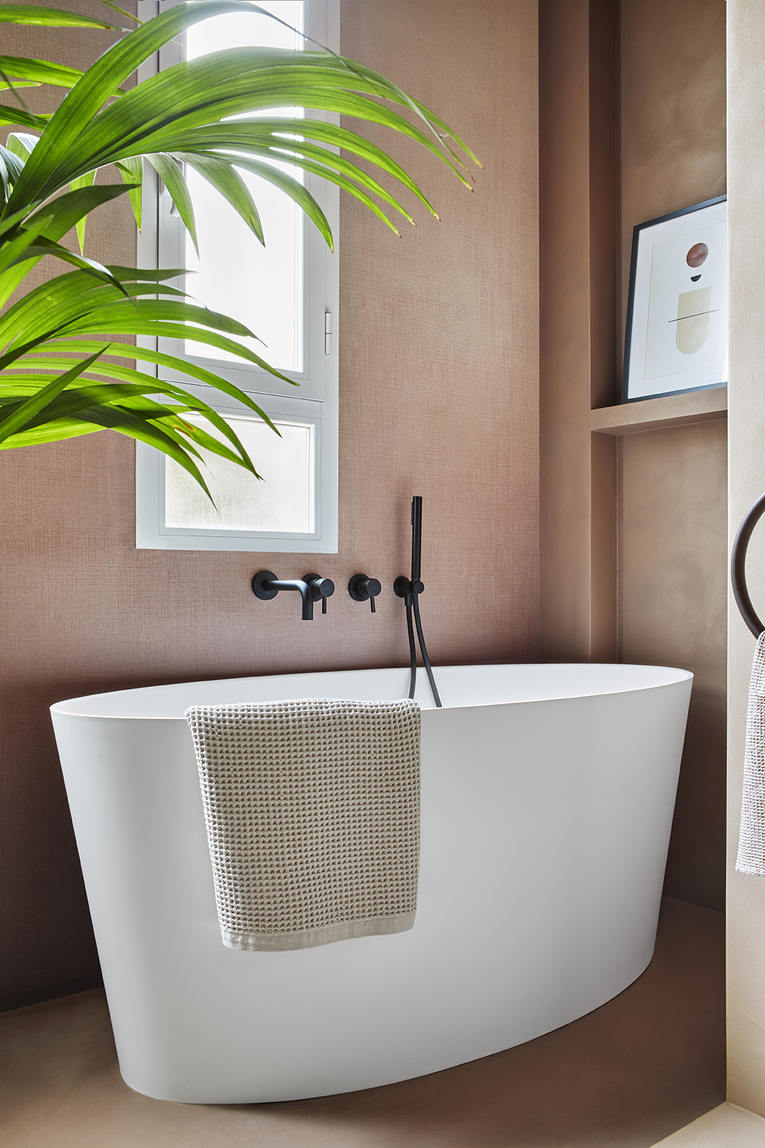
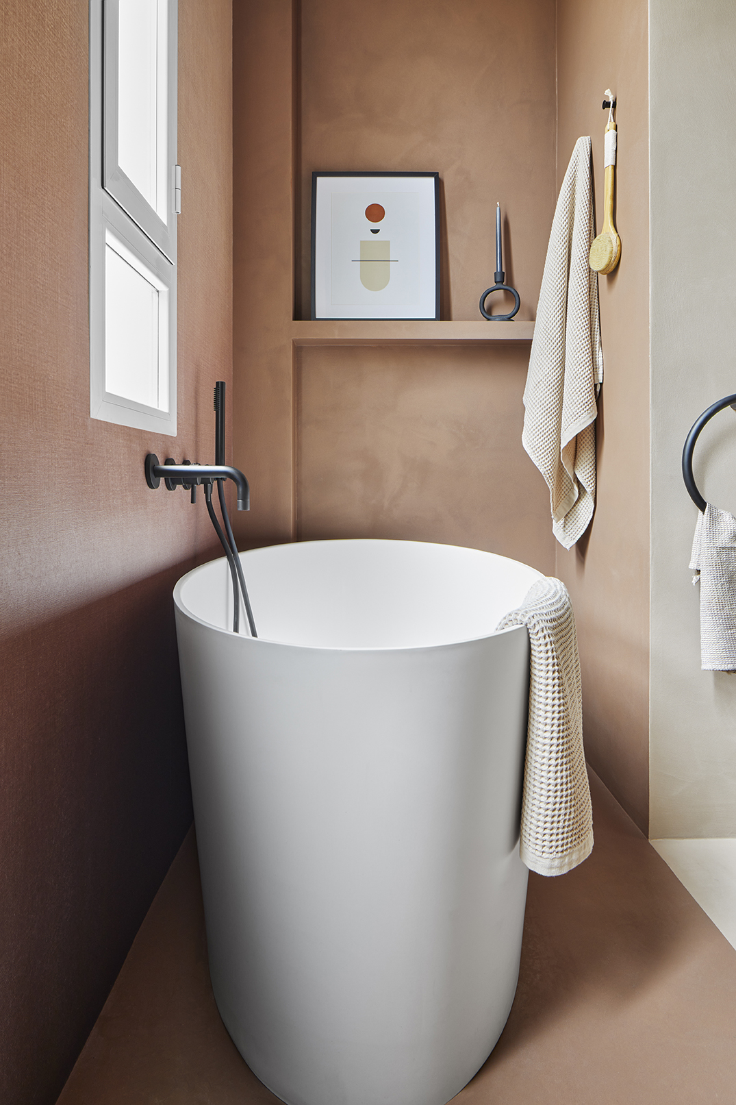
The royal blue accompanies us inside an environment designed by contrasts between the light sienna and the red clay tones that divide the space with a horizontal line, which separates the shower / tub from the rest. Colours and materials create a textured and sandy look, made possible by Innovative Surface’s continuous concrete coating, which completely covers this room, giving it an authentic bathroom look. For the shower / tub wall, we chose a fibreglass wallpaper with a decoration where the two main colours fade from dark to light. Again, Texturae customised their Shadow wallpaper specifically for the customer by changing the colours.
Light played a big part in this apartment. The use of lighting coves create plays of light, while the recessed spotlights lead you to discover all the different environments. The iconic design lamps highlight the glamorous vibe of this home, where no detail is left to chance.